LxL Creative
Brand System | Logo Design | Digital Collateral
LxL Creative is a globally recognised production agency with over 30 years in the television industry, now working with major clients including Prime and Sky. Despite their growth, their self-built brand and website no longer reflected the bold, energetic, female-founded studio they had become - holding them back in an increasingly competitive space.
The project
Understanding LxL Creative’s ambitions, it was clear the brand needed a bold, future-facing transformation. I led a full rebrand, developing a new visual identity including logo, typography, colour palette, web design concepts and a distinctive graphic system designed to reflect the agency’s energy and personality.
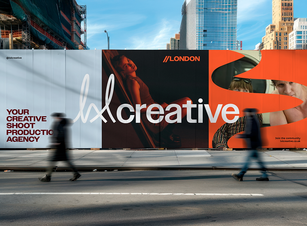
The concept combined subtle vintage references with a more contemporary, editorial aesthetic - capturing the breadth of production styles LxL work across. A key focus was introducing a sense of movement and fluidity throughout the identity, reflecting storytelling at the heart of their work.
This was brought to life through a dynamic line motif, derived from the logo and applied across the wider visual system. The motif represents narrative flow, creative energy, and the full-service, 360 nature of the agency.


Design challenges
LxL Creative has ambitious plans for the future and already operates alongside its sister brand, LxL Studios - a relationship that needed to be thoughtfully considered within the wider brand identity system. The challenge was to create a logo for LxL Creative that felt adaptable enough to support future brand extensions, while remaining distinct and recognisable as the flagship brand.
After exploring a range of creative directions, I found that the contrast between the fluid LxL icon and the confident ‘Owners’ typeface created a sleek, versatile logo lock-up that balanced flexibility with authority. The resulting identity established a strong foundation for the wider brand ecosystem, while allowing ventures such as LxL Studios to emerge naturally under the same visual language.
Alongside this, the branding needed to strike a balance between boldness and professionalism, while also reflecting the global scale at which LxL operates. From the earliest conversations, it was clear that the company’s personality and energy were central to its success - not only shaping its identity, but also driving the strength of its partnerships and continued growth.


What I did
The final brand system was built to feel energetic, fearless, and impossible to overlook within LxL’s industry space - capturing both the passion behind the team and the exceptional standard of their work. Their newly developed strapline, ‘Real craft, real people, real results’, is reinforced through raw, expressive typographic elements that reveal the layered nature of their creative process and hands-on approach.
The colour palette brings a balance of personality and grit, reflecting the wide range of stories LxL captures and the authenticity at the core of the brand. Running throughout the identity, the flowing accent line acts as a visual representation of LxL’s full-circle approach - symbolising the seamless, end-to-end storytelling and 360° service that defines the way they work.


The impact
Since the brand launch, I’ve continued working closely with LxL across a wide range of digital touchpoints to ensure the identity remains cohesive, engaging, and instantly recognisable. This has included the creation of dynamic pitch decks, social media assets, bespoke email signatures, and brand launch invitations - all designed to carry the same energy and personality established within the core identity. I also had the opportunity to join the team in celebrating both the brand launch and LxL’s 5th birthday event, seeing the identity come to life within the community that inspired it.


